So you’re setting up or developing a business? What should you be focusing on? How do you develop a brand? How do you get people to engage with your brand? If your service or product is the best then people should know you’re there. This article is here to help. StuPrint.com has had thousands of great (and not so great) brandings come across it desk…and we’ve picked up a few things. Furthermore, as a small company setup by students (for students!) in Oxford, we know a fair bit about the trials and tribulations of developing a successful brand and getting it out to the public. We also know the sheer importance this can have for any small business. So listen up- here we go…
This article is aimed at those of you that have taken the massive step in starting a small business. Up to this point you will have found your niche, honed your service, selected suppliers, got yourselves fully registered and are ready and raring to go. But you should take a moment to stop and think. There are some, on the face of it, small details that absolutely must be ironed out before sending yourselves out there: brand development and message deliverance.
1. Brand Development - Consistency is King:
It is imperative that you build up a brand that contains the essence of your actual product or service. What is more, however, is that you stick to this brand through thick and thin.
The most successful brands out there are recognizable at the drop of a hat. You could be driving past a billboard at 60mph and catch the slightest glimpse of a color, logo or font and know exactly who that company is. Furthermore, you’ll know exactly what that brand is about. You’ll remember news stories you’ve read about them and experiences you encountered with that business, but more importantly, it will reaffirm the fact that that company is still out there. In this sense, branding is the front door to a business inviting you in for tea.
This sort of brand recognition is the Holy Grail. But there is more to it than stumbling upon a charmed logo or color that just happens to connect with people more than others. These brands have been massively thought out. Everything about a successful brand will encompass the essence of the business. It will give you that initial inkling of what that company stands for. Furthermore, the most powerful brands- the ones that are instantly recognizable and known the world-over- have been built up over years and years and have changed very little. People built them up and stuck with them. This is so important. When it comes to brand development- consistency is king.
So set up a brand that speaks about you and stick with it. But how does one go about that? What do you need to consider when developing a brand? The next section will look at the 3 key steps and will bring in some success stories along the way to show you how the pros did it.
Selecting a Color Scheme
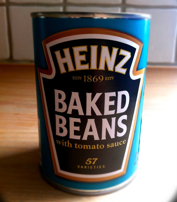
You might initially be thinking that color pallets are not really that important in branding. You’d be wrong. Consistent color pallets are crucial. This point is slightly subtler than the role of logos, but it is so easy to see how consistent color themes can make all the difference. If I show you a small section of this product’s tin label:

Some of you will know exactly which product it is immediately.

The color of Heinz Baked Beanz tin is recognizable the world over, but especially in the UK and North America. Heinz Baked Beanz, first produced by the H.J. Heinz Company in 1901 and in 2005 it was voted “the Most Love British Brand” by the UK public. No small part of this will be down to the underlying brand and that famous blue/turquoise color used on its tins and print advertisements. The important fact to take away from this is that the color has remained essentially unchanged for over a century. People know it and know what it means and what it stands for. So when it comes to you deciding a color that relates to your brand make sure you like it and make sure you stick with it.
StuPrint.com’s logo and color scheme throughout our online platform is tied to the industry we find ourselves in- printing.

The color reference and crop marks to the right of the logo immediately reference the essence of the industry. These colors are the route colors used in all lithographic printing: Cyan, Magenta, Yellow and Black (CMYK). The idea here is that people know immediately, if only on a sub-conscious level, what we are about and what we do. Give it some thought and you might be able to come up with a similar strategy for your brand. But remember, if you do go for a specific pallet (and we really think you should), make sure you stick with it.
Selecting a Font Family:
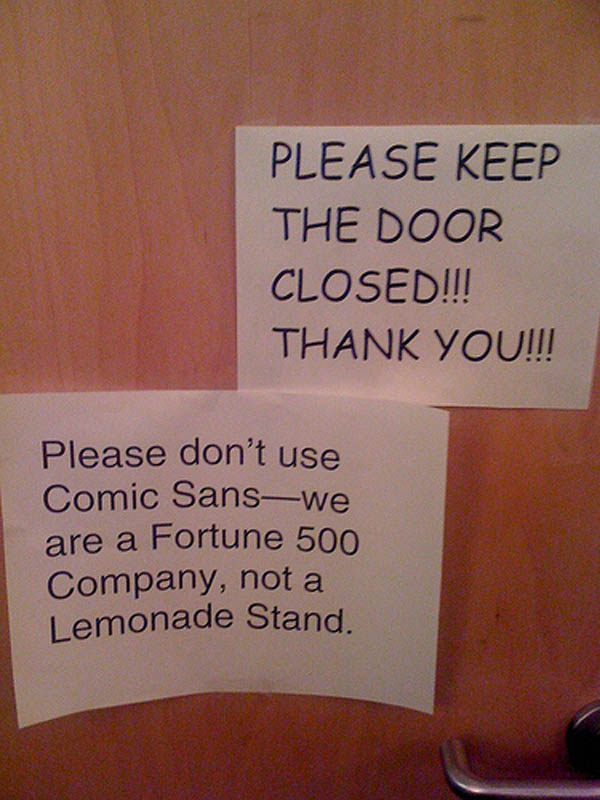
It may be a shock but there are actually other fonts than Arial and Times New Roman out there. Have a look around and see the wide range available. I think this photo nicely sums up the message of this section:

The message is simple: fonts have inherent feel to them. This is quite an abstract statement but the photo above corroborates this point. People, for whatever reasons, take different messages out of different fonts. Some might delivery power, professionalism and formality, whilst others might be more relaxed, fun and welcoming. So at this point you should be taking a long hard look in the mirror. What image do you want your brand to convey about you?
For StuPrint.com, we have selected ‘Cicle’ for the majority of our text, including the text in our logo. We feel it is stylish and welcoming without being brash or unprofessional. These features are perfect for our market because as a printer, we want to purvey a sentiment of openness/transparency as well as showing that we know out way around good bit of design.
When writing text for print publicity or content for your website there will be times when you will want to move around within a font family. The use of bold, italic, regular, as well as Serif and Sans Serif font sub-sections can be very useful in delivering your message.

Each one can be used to different effects. It is often better for titles to be comprised of the stronger, more attention grabbing sections- bold or bold and italic for example. This is useful for flyers and posters as well as for website content as the crux of your message, whether it be an offer your trying to get across or a your overall mission statement, will be in the title.
As with the above section on color pallets, just make sure you are consistent. Fonts, especially when combined with your unique color pallet, are important! StuPrint.com is here to help you with any advice you might need.
Design a Logo to help your Brand:
Perhaps even more so than color and fonts, a well-delivered and well-designed logo can make all the difference to a brand. Just sit back and think for a moment about all the fonts you regularly encounter. I’d wager you’re probably surrounded by dozens of logos as you read this. Fundamentally, logos are key. You have to have one.
Unfortunately, as a printer of many thousands of pieces of print publicity, we see many dodgy logos come across our desk. They can fall-down on so many aspects: pixilation, poor color reproduction, poorly scaled etc., but more often than not they are just poorly conceived. A logo really is one of those things that you need to give some thought to. How complex should it be? What should it say about the business? Color? Tone? Gradient? The list is extensive.
More than any other components of a brand, the logo is the one we suggest you get in touch with a graphic designer about. With a bit of luck, it will be with you throughout the life of the business so it really needs to be great. A designer will ensure that it is designed with the exact pantones you’ve decided on and, more importantly, will deliver back a fully vectored design. The benefit of vectoring is that it allows for trouble free scaling, meaning that your logo will look great whether it’s on a business card or flyer, or billboard or large format poster. In essence, a high-quality logo is the best start for a high-quality brand.
If you have got a bit of design flare and want to be really hands on with your logo then by all means have a go. Just make sure you get feedback from friends and family. Candor is key here. The best programs in our experience are Adobe Illustrator and Adobe Photoshop. They allow you to shape every aspect of your design so you can get it to look exactly how you want. Furthermore, they allow you to vector your image, which, as we’ve already mentioned, is crucial.
Assembling your brand:
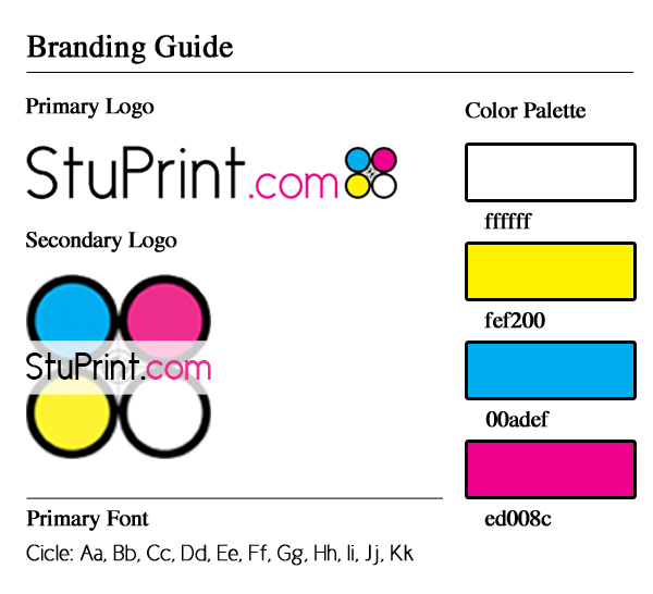
Now that you’ve successfully selected the colors, fonts and logo for your brand, its time to bring them all together. Remember- consistency is king. One way of ensuring that your brand remains constant (and therefore powerful!) is through the use of a branding guideline document. Branding guideline documents can be very useful, especially as your company starts to grow and you have different departments running different campaigns related to your brand.

As we can see here, this simple but very useful document allows you to explicitly state the exact font families, color pallets and acceptable logos integral to your brand. It will act as a reference point for all future marketing.
2. Rolling out your Brand
Now that you have a consistent and well-considered brand, what is the best way to get it out there? As a well-established online printer, we here at StuPrint.com have seen it all and we can say, without reservation, that printing is a must. Web advertising and bulk emails are a solid second, but a well-delivered print marketing campaign will put you strides ahead of your competitors.
When it comes to selecting a print marketing campaign it really is a matter of horses for courses. Unfortunately, it is also a matter of budgetary constraints. In an ideal world we would all have as much money to put towards printing as possible but unfortunately it is not an ideal world. This means one thing- you have to prioritize. Different printed products say different things about you and allow for different sorts of interaction with your customers. So with your glossy new brand, which delivery is best for you? Well here is a handy list we have put together from our experience:
- Business Cards: These tend to be inexpensive and useful but a highly scrutinized tool. There is no other printed product that is looked over more than the business card so make sure you get it right. Paper weight, paper finish and shape are all important factors. As a rule, it tends to be that heavier is better. Whilst there are wackier styles out there, we would air on the side of restraint and go traditional- heavy and uncoated. Think about from American Psycho! Business cards are very important when it comes to face-to-face business or picking up business on the fly. Make sure you’re prepared.
- Flyers and Leaflets: Flyers are extremely well suited to mass-communication. If your product/business is likely to appeal to a wide customer base then flyers and leaflets are the way forward for you. A6 flyers, in our experience are by far and away the most popular flyer product. They are inexpensive but offer enough area for you to convey most messages. StuPrint.com can offer 5000 A6 flyers for £72.50, which makes door-to-door- flyering, or handing out in the street a very efficient print marketing strategy. We send hundreds of thousands of flyers up to the Edinburgh Fringe Festival each year for just these reasons. Again, weight is important here as, frankly, a heavier flyer holds more gravitas than lighter flyer. But lets not forget about budget constraints! Simply work out how many people in an area you want to get in touch with and find the price that you can justify.
- Posters and Banners: StuPrint.com has printed millions of A3 to A0 posters for student drama groups up and down the country. The reason for this is that student groups operate in areas where there are clear focal points where putting up well-designed posters can be very effective, for example bars, pubs, lampposts and student common rooms. We have found that for student organizations and events, A3 posters are incredibly popular. This is mainly because there is a large jump in unit price from printing A3 posters to printing A2 and above posters. Whilst large-format posters tend to have more impact, having a wide spread of smaller posters might be more advantageous for your brand.
- Booklets and Brochures: These tend to be more expensive than the other printed goods mentioned so far but they certainly have their place. When you have a large amount of information to get across then booklets are the only way forward. The most obvious example of this is the theatre program. Booklets are certainly the best way forward when you are drilling deep down into your core customer base.
The message here has been that you really do need to give a lot of thought to your brand, and how you get your brand out there before taking the first step. People engage and trust familiar brands so make yourself recognizable! But don’t forget that you need to get yourself out there. There is no point in being the best if no one knows you’re there so make sure you formulate a well-delivered print marketing campaign. StuPrint.com is here to help at every step of the way!
StuPrint.com brings you cost-effective rates on a great choice of professionaly printed items, including printed flyers, posters, booklets, flyers, posters, leaflets, business cards, stickers, calendars, banners, invitations, letterheads, brochures and magazines
MORE ARTICLES!
Interested in the print market? Why not find out a bit more about StuPrint and where they sit in the industry as an online print brokerage?
Do you already have your print campaign in mind? Then its time to get your artwork print ready. This handy little blog article will help
Posters can be a powerful marketing tool. Have a quick read here to find out how they might be able to help you
If you’re ordering a range of printed material then this article will help with making the most of them at your event
PRINT OFFER: Get 25% off your print order when you advertise us on your website. This page gives you more information
Confused by the print industry? You’re not alone. We put together a glossary of terms to help you break down the print jargon
